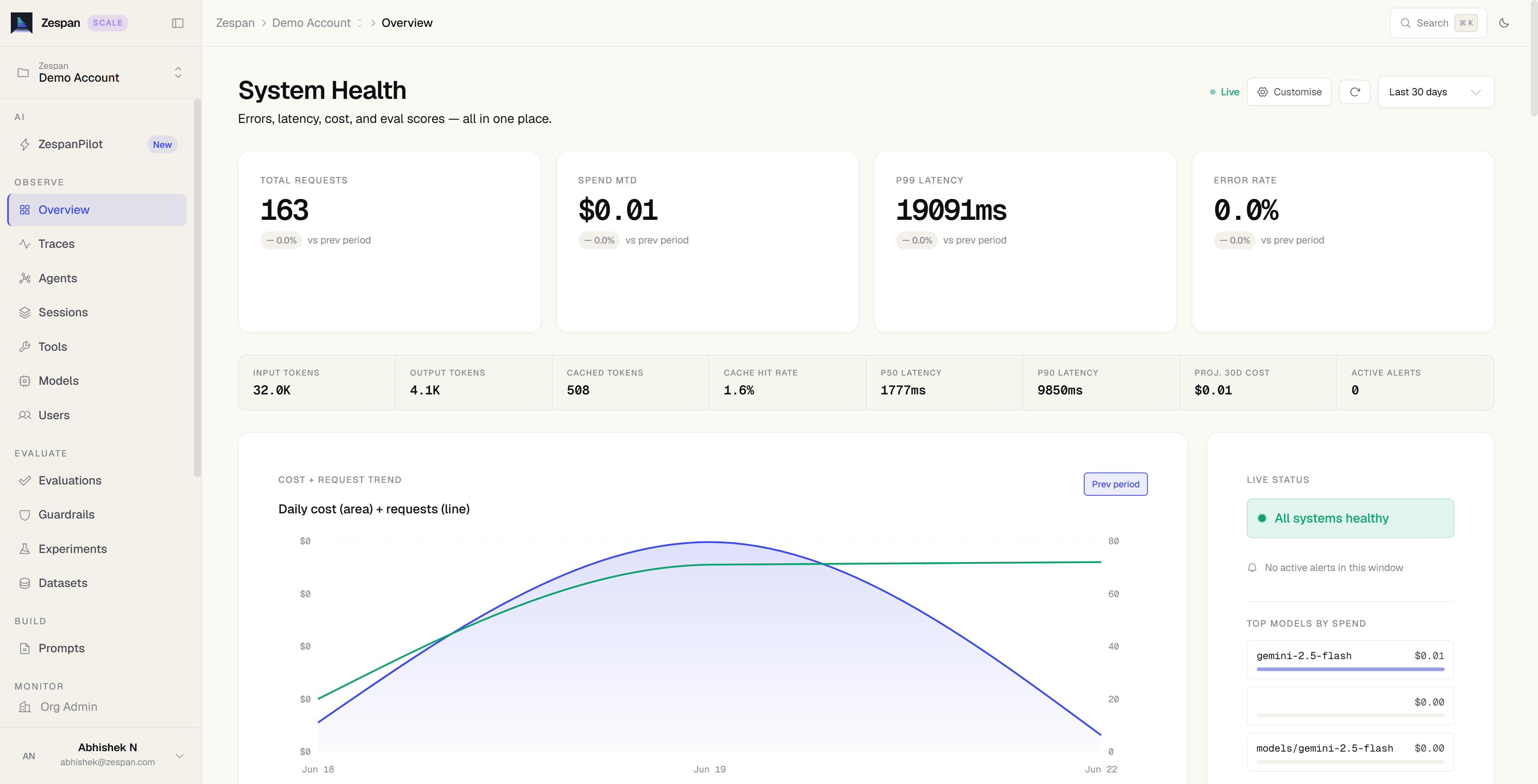
The System Health page is the first thing you see after opening a project. Instead of a fixed set of “OK” badges, it computes a live verdict — healthy or degraded — against thresholds you define for that project, and it never shows a fake healthy status before you’ve sent any real traffic.
Before your first trace
System Health is available on every plan, including Free.
- A wait pill at the top reads “No traces yet” until your SDK sends its first event, then “First trace received,” then “N traces · warming up” as data accumulates.
- The verdict slot stays blank with an explanation — “No verdict yet” — until there’s enough traffic to judge. One trace alone isn’t enough to compute an error rate, so the page says so rather than guessing.
- Every KPI slot (error rate, P95 latency, spend today, requests) renders as an empty, dashed placeholder with a
— value and a WAITING badge instead of a fake number.
A floating Getting Started checklist walks you through the six steps to get here: create your workspace, set your thresholds, connect the SDK, see your first trace, customize the dashboard, and take a tour (optional). It tracks your progress automatically — the SDK and first-trace steps tick off as soon as real data arrives, no manual confirmation needed.
If a project has ingested traces before but the currently selected time range has none, you get a different, narrower empty state: a “quiet window” message if the gap is under 48 hours (with a one-click jump to a wider range), or a “we haven’t heard from your agents” warning with likely causes (rotated API key, SDK not initializing, network/firewall blocking ingest) if the gap is longer.
Setting your health thresholds
Set your thresholds before you need them — do this from the empty-state screen the first time you open a new project.
The verdict banner
Once your project has real traffic, the top of the page shows one of two states:
- Within all thresholds (or All systems healthy if you never customized thresholds) — a summary line naming your current error rate, P95 latency, and today’s spend, plus how many agents and tools are reporting.
- System degraded — names exactly which threshold was breached and by how much (e.g. “Error rate 12.0% is above your 5% limit”), with a badge showing the breach count and the active incident count, and quick links to review incidents or see the failing traces.
Tool success is only judged if your project has actually invoked tools — pure-LLM projects with no tool calls never get a false “0% tool success” breach.
Below the verdict, an active alerts strip appears if any alert rules are currently firing, showing up to four with a link to view all.
KPI cards and triage row
Four golden-signal cards sit below the banner — Error Rate, P95 Latency, Spend (Today), and Requests — each with a status badge, a trend arrow versus the prior period, a sparkline, and your threshold as a caption.
Beneath the cards, a two-column triage row surfaces what needs attention next:
- What to fix first — up to three ranked, concrete problems (the agent with the worst error rate, an operation exceeding its latency target, a cost spike), each with a direct link to investigate.
- ZespanPilot digest — an AI-generated summary of what changed, with quick-action links into the relevant page.
Drill-down tabs
Five tabs below the triage row let you go deeper without leaving the page:
Customizing your dashboard
Click Customise in the page header to open a panel where you can toggle which KPI widgets are tracked for your project — grouped into Essentials, Cost & Usage, Performance, Health, and Explore — or apply a starting layout (Engineering, Operations, or Leadership). Your selection is saved to your project’s dashboard preferences. The first time you complete onboarding you’re also prompted to pick one of these starting layouts.
Time range
The range selector in the top-right controls the window all KPIs, the trend chart, and the tabs are computed over: Today, Last 24h, Last 7 days, Last 30 days, or a custom date range. Data refreshes from a 5-minute cache; use the refresh button next to the range selector to force an update (rate-limited to once every 5 seconds).
If your weekly spend more than doubles versus the prior week, a cost-spike banner appears above the checklist with a direct link to the Costs page.