

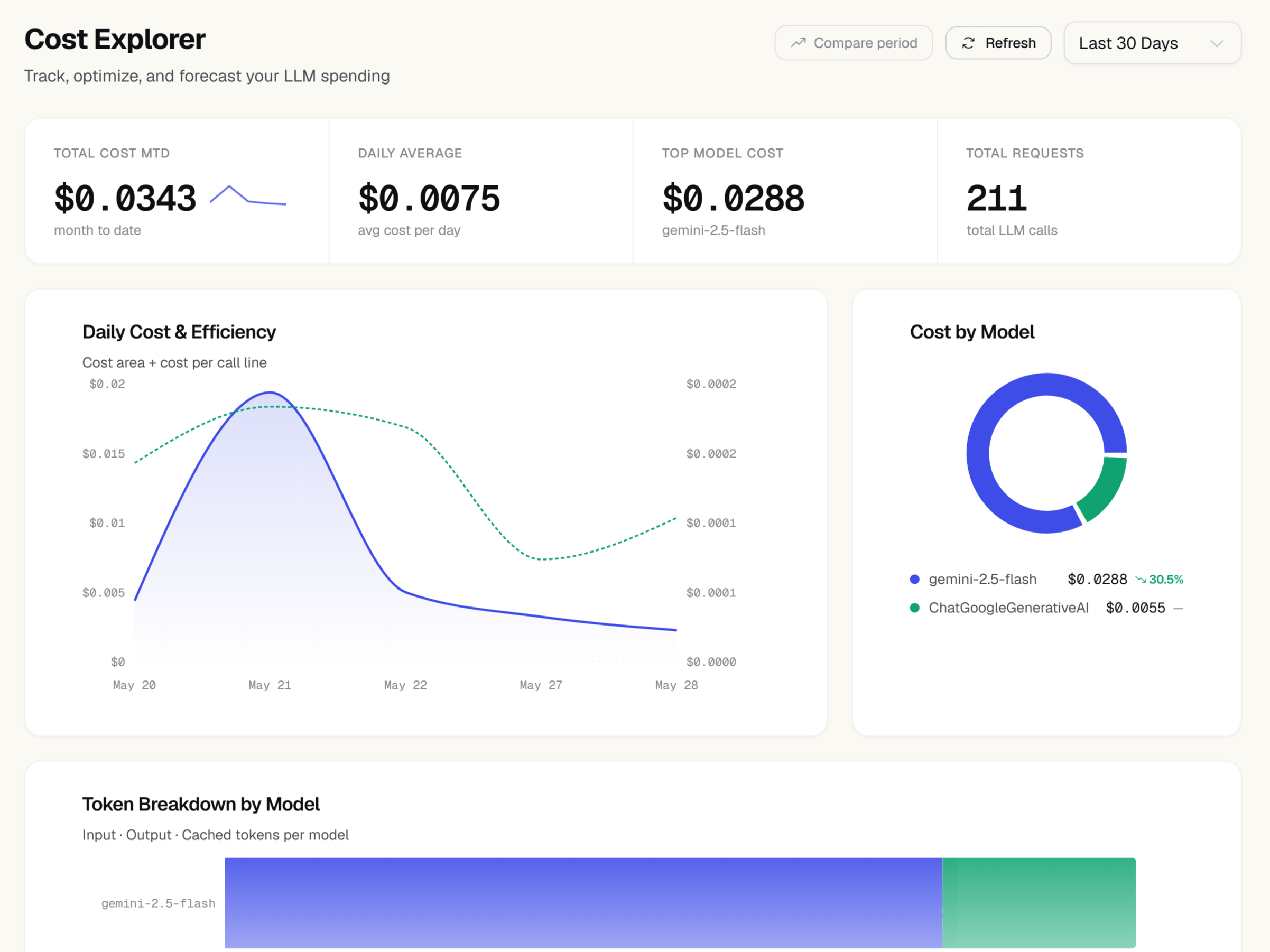
Full cost attribution and forecasting require the Pro plan or higher. Basic cost totals are visible on all plans.
Cost by model
The bar chart at the top of the page ranks every model you’ve used in the selected period by total spend. Each bar shows the model name and its USD cost for the period. Hover over a bar to see the underlying numbers: number of calls, total tokens, average cost per call, and cache hit rate. This chart answers the most common cost question immediately: “which model is responsible for most of my bill?” If one model towers above the others, that’s your highest-leverage target for optimization.Cost over time
The line chart below shows your daily spend across the selected date range. Each point represents total cost for that calendar day across all models. Use this chart to spot:- Sudden spikes that coincide with a deployment or feature launch
- Gradual cost growth that may indicate increasing usage or a model change
- Days with unexpectedly low cost that may point to an outage or misconfiguration
Cache hit ratio
The cache hit ratio card shows what percentage of your input tokens were served from the model provider’s prompt cache rather than recomputed from scratch. A higher cache hit ratio means lower cost and lower latency for those requests. The card displays:- Cache hit ratio — percentage of total input tokens that were cached
- Cached tokens — the raw count of tokens served from cache
- Estimated savings — the USD amount saved by not recomputing those tokens
Month-to-date spend
The gauge in the upper-right corner shows your cumulative spend for the current calendar month. The gauge fills from zero toward the outer ring, which represents your budgeted monthly limit (if you’ve set one). The exact dollar amount is shown in the center.30-day forecast
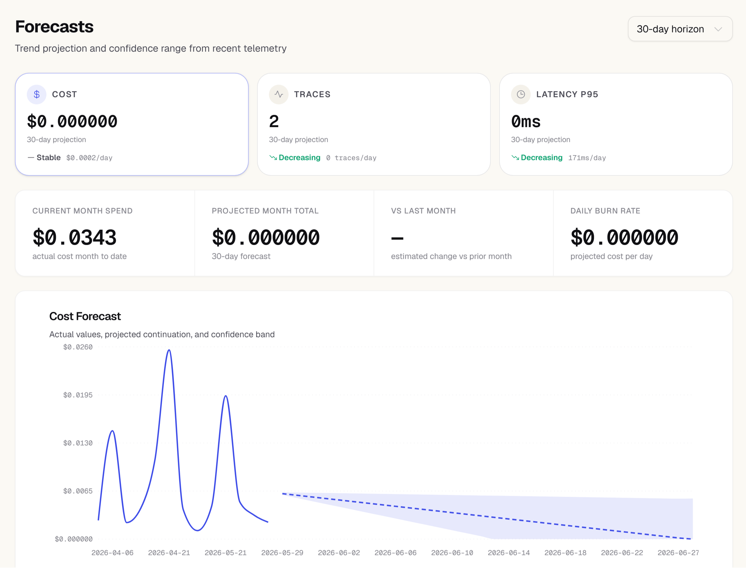
The forecast uses the last 14 days of data to calculate the daily average. If your usage pattern is highly variable or you recently made a significant change (such as switching models), treat the forecast as a directional signal rather than a precise prediction.
Cost by user
If your SDK passes auserId when creating spans, the cost by user table breaks down spend per user for the selected period. The table shows each user ID, their total cost, number of requests, and average cost per request, sorted by total spend descending.
This view is useful for understanding which users or user segments are the most expensive to serve, and for detecting unusual individual usage that may indicate a bug or abuse.
The cost by user table only populates for requests where your SDK explicitly sets a user ID. If you haven’t configured this, see the SDK documentation for how to attach user context to your traces.
Acting on cost data
The Costs page is most useful when it informs action. Here are two common levers:Adjust your SDK sample rate
Adjust your SDK sample rate
If your costs are higher than expected and your application can tolerate missing some traces, reduce the
sampleRate in your SDK configuration. A sampleRate of 0.5 sends half of all events to Zespan, cutting your event quota usage and any associated overage charges in half. Set it in your SDK initialization:Switch to a less expensive model
Switch to a less expensive model
If the cost by model chart shows that one expensive model handles a large share of your requests, consider whether a smaller model could handle some of those workloads. Use the Cost Optimizer at the bottom of this page to analyze a specific trace and get a model-switching recommendation with a confidence score.
Retroactive Evaluations
Score historical traces against an evaluator you didn’t have configured when the traffic actually happened — you don’t need to have predicted which quality metric you’d want in advance.1
Open the Retroactive Evaluations panel
Scroll to the Retroactive Evaluations panel on the Costs page.
2
Pick an evaluator
Choose any existing evaluator — built-in or custom.
3
Set a time range and optional filters
Pick the historical window to score, and optionally narrow it to a specific operation or model.
4
Run it
Zespan resolves every matching historical trace and scores it with the same LLM-judge pipeline live auto-evaluation uses. Results are tagged as retroactive so you can tell them apart from live scores.
Cost-Quality Frontier
Once you have quality scores — live or retroactive — alongside your existing cost data, the Cost-Quality Frontier chart plots every model actually used on a given operation by real cost vs. real quality, joined at the individual LLM-span level rather than a coarser trace-level average, so a multi-model trace doesn’t get misattributed to the wrong model. Each point is one (model, operation) pair. Points with quality data are colored by score; grey points haven’t been scored yet — run a retroactive evaluation to fill them in.Cost Optimizer
The Cost Optimizer analyzes a specific trace and tells you whether a cheaper model could handle the same task — and by how much your cost would drop. Plan availability: Pro and aboveHow to use it
Enter a trace ID in the Cost Optimizer panel (scroll to the bottom of this page) and click Analyze. The engine evaluates the trace’s task complexity against model capability and returns a recommendation. Task complexity is scored on a 1–10 scale:- 1–3 — simple classification, extraction, short Q&A
- 4–6 — summarization, structured output generation
- 7–10 — code generation, multi-step reasoning, tool use
What you get back
Next steps
- Value — this page tells you what you spent; Value tells you what that spend actually produced, joining reported business outcomes to the same per-trace cost data
- Cost-Quality Frontier — the quality-adjusted view of cost, using evaluator scores instead of reported business outcomes
- Models — the per-model table behind this page’s cost-by-model chart, with latency and error-rate columns alongside cost
- Model Lifecycle — if a model driving your spend also has a provider-announced end-of-life, this is where that gets flagged