> ## Documentation Index
> Fetch the complete documentation index at: https://docs.zespan.com/llms.txt
> Use this file to discover all available pages before exploring further.
# Performance — latency metrics and throughput analysis
> Track P50, P90, and P99 latency, time-to-first-token for streaming calls, and request throughput across models, environments, and time ranges.
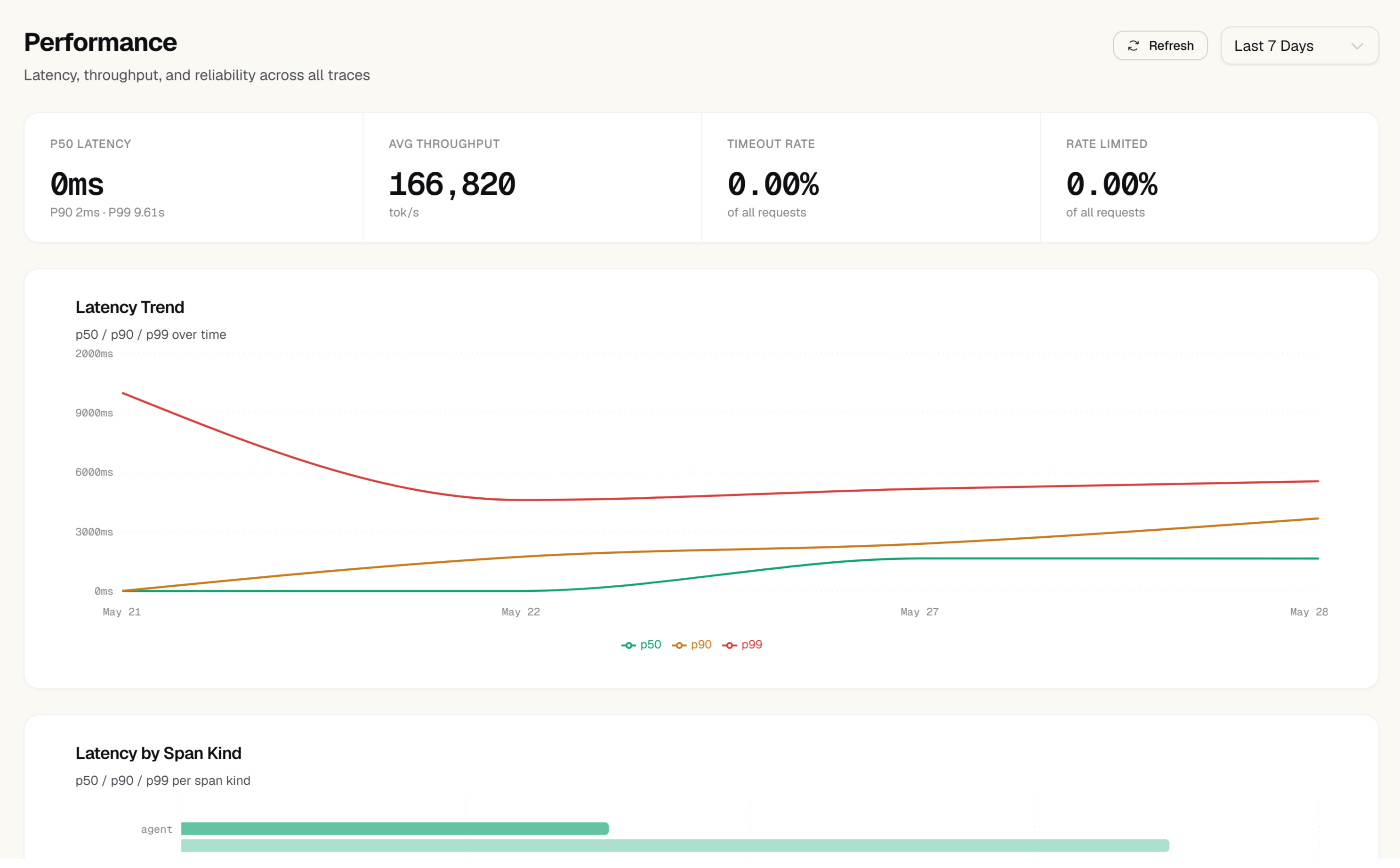
The Performance page gives you detailed latency and throughput metrics for your LLM operations. While the Overview page shows a single average latency number, Performance lets you drill into the distribution — including the tail latency that affects your slowest users — and break it down by model, environment, and time period.
 ## Latency percentiles
The top section of the Performance page shows three percentile cards for the selected time range:
Half of your requests complete faster than this. Represents the typical user experience.
90% of requests complete faster than this. The first signal of performance problems affecting a significant minority of users.
99% of requests complete faster than this. Represents your worst-case latency for regular users. This is the number that wakes people up.
Each card shows a trend arrow comparing the current period to the previous equivalent period, so you can see whether tail latency is improving or degrading over time.
## Latency distribution histogram
Below the percentile cards, a histogram shows the full distribution of response times for the selected period. The x-axis is latency in milliseconds; the y-axis is the number of requests that fell in each bucket.
Use the histogram to understand the shape of your latency distribution:
* **Tight distribution** — most requests take roughly the same time, which means your application is predictable
* **Long tail** — a small fraction of requests are significantly slower, which may indicate timeouts, retries, or large inputs
* **Bimodal distribution** — two distinct peaks often indicate two different code paths (e.g., cached vs. uncached requests, or two different models)
## Time-to-first-token (TTFT)
For streaming LLM calls, time-to-first-token (TTFT) is often more important to users than total latency — it's how long they wait before they see any output. The TTFT card shows your P50, P90, and P99 TTFT for streaming requests.
TTFT is only available for requests where `stream: true` was sent. The SDK captures TTFT automatically for all wrapped streaming calls.
A high TTFT with low total latency suggests the model is spending most of its time on prompt processing before generating output. This is common with large system prompts — consider caching or compressing them.
## Latency by model
The **By model** table ranks all models you've used by their P99 latency. For each model you see:
| Column | Description |
| ------------- | ------------------------------------------- |
| Model | The model identifier |
| P50 | Median latency |
| P90 | 90th percentile latency |
| P99 | 99th percentile latency |
| TTFT P50 | Median time-to-first-token (streaming only) |
| Request count | Number of calls in the period |
Click any model row to filter the histogram and time-series chart to that model only.
## Latency over time
The time-series chart below the table shows how P50, P90, and P99 latency have moved over the selected date range. Toggle individual percentile lines on or off using the legend. Use this chart to:
* Correlate latency changes with deployments
* See whether tail latency is trending up before it becomes a user-facing issue
* Identify time-of-day patterns (e.g., provider slowdowns during peak hours)
## Throughput
The **Throughput** section shows requests per minute (RPM) over time. Use this to:
* Verify that your application handles traffic peaks without dropping requests
* Correlate throughput changes with latency changes (high throughput often correlates with higher tail latency)
* See your peak traffic periods, which is useful for capacity planning
## Filtering
All charts and tables on the Performance page respect the global filter bar:
* **Date range** — select a preset or custom range
* **Model** — filter to one or more models
* **Environment** — separate production, staging, and development data
* **User ID** — drill into performance for a specific user
Filters update all charts simultaneously.
## Latency percentiles
The top section of the Performance page shows three percentile cards for the selected time range:
Half of your requests complete faster than this. Represents the typical user experience.
90% of requests complete faster than this. The first signal of performance problems affecting a significant minority of users.
99% of requests complete faster than this. Represents your worst-case latency for regular users. This is the number that wakes people up.
Each card shows a trend arrow comparing the current period to the previous equivalent period, so you can see whether tail latency is improving or degrading over time.
## Latency distribution histogram
Below the percentile cards, a histogram shows the full distribution of response times for the selected period. The x-axis is latency in milliseconds; the y-axis is the number of requests that fell in each bucket.
Use the histogram to understand the shape of your latency distribution:
* **Tight distribution** — most requests take roughly the same time, which means your application is predictable
* **Long tail** — a small fraction of requests are significantly slower, which may indicate timeouts, retries, or large inputs
* **Bimodal distribution** — two distinct peaks often indicate two different code paths (e.g., cached vs. uncached requests, or two different models)
## Time-to-first-token (TTFT)
For streaming LLM calls, time-to-first-token (TTFT) is often more important to users than total latency — it's how long they wait before they see any output. The TTFT card shows your P50, P90, and P99 TTFT for streaming requests.
TTFT is only available for requests where `stream: true` was sent. The SDK captures TTFT automatically for all wrapped streaming calls.
A high TTFT with low total latency suggests the model is spending most of its time on prompt processing before generating output. This is common with large system prompts — consider caching or compressing them.
## Latency by model
The **By model** table ranks all models you've used by their P99 latency. For each model you see:
| Column | Description |
| ------------- | ------------------------------------------- |
| Model | The model identifier |
| P50 | Median latency |
| P90 | 90th percentile latency |
| P99 | 99th percentile latency |
| TTFT P50 | Median time-to-first-token (streaming only) |
| Request count | Number of calls in the period |
Click any model row to filter the histogram and time-series chart to that model only.
## Latency over time
The time-series chart below the table shows how P50, P90, and P99 latency have moved over the selected date range. Toggle individual percentile lines on or off using the legend. Use this chart to:
* Correlate latency changes with deployments
* See whether tail latency is trending up before it becomes a user-facing issue
* Identify time-of-day patterns (e.g., provider slowdowns during peak hours)
## Throughput
The **Throughput** section shows requests per minute (RPM) over time. Use this to:
* Verify that your application handles traffic peaks without dropping requests
* Correlate throughput changes with latency changes (high throughput often correlates with higher tail latency)
* See your peak traffic periods, which is useful for capacity planning
## Filtering
All charts and tables on the Performance page respect the global filter bar:
* **Date range** — select a preset or custom range
* **Model** — filter to one or more models
* **Environment** — separate production, staging, and development data
* **User ID** — drill into performance for a specific user
Filters update all charts simultaneously.